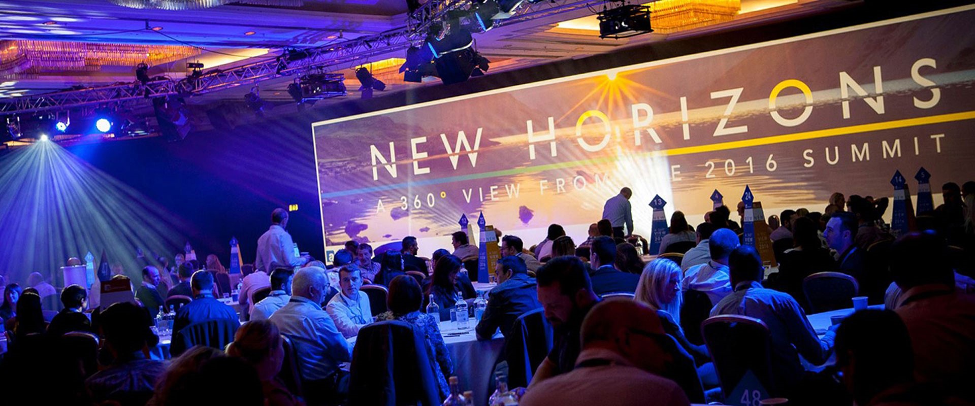
When we won a pitch to design and deliver Aldermore Bank’s annual conference back in April, it seemed like a fairly relaxed timescale to sort everything out for mid-October. Sure enough the event has just taken place to rave reviews and all round back-slapping:
“What a fantastic achievement – you chaps have done a fabulous job here.”
Although most of the 800 or so attendees, were blissfully unaware of the blood, sweat, tears and general ‘above and beyond’ effort needed to get it over the line.
Aldermore is one of a new breed of ‘challenger banks’ that have appeared since the banking crisis of 2008. Since launching in 2009 they’ve grown rapidly to joining the FTSE 250 in 2015 and pass the £5Bn mark in terms of deposits. They focus on supporting small to medium sized businesses, asset finance and residential mortgages. The event was held over 2 days at the Hilton Metropole Hotel at the NEC with the bank’s 800 staff split over each day.
As well as developing the ‘New Horizons’ theme and designing a brand around
it for the event, we then designed and created a whole suite of marketing materials, digital assets and large format graphics. The list seemed endless from pre-event marcomms, delegate packs, table toppers, ‘world café’ sheets, tee shirts, directional signage, animations and a wealth of infographics. Impressive large format graphics included two 6 metre long welcome displays, registration signs and a 18 metre long ‘time-line’ of the bank’s history since it started in 2009.
Six individual presentations were brought to life with designs of icons, illustrations, imagery and typography, through the New Horizons concept. A single powerpoint presentation deck with over 250 individual slides each with transitions ranging from singular and simple to multiple and complex. This deck worked as the in-show backbone upon which dual live TX, ‘pipped’ (picture in picture) along with full wide format VT was weaved via full HD projectors onto a huge 20 metre x 4 metre screen.
All of which was in place on time and worked seamlessly, although the inevitable panic of a hectic run in was somewhat heightened with some seismic last minute changes. However, judging by the positive feedback, we managed to pull it off.
“Hey, if we bomb on stage, at least we’re gonna look great doing it!” Said one of the key presenters, when bd2’s design director Stuart Green wished him well just before he delivered his speech.

