
Ux, which stands for User Experience - and I’ll apologise now for the use of these kind of abbreviations and acronyms as there’s lots of them coming up - has always been critical to the success of any B2C [business to consumer] website because a potentially better experience is but one click away. The same can not always be said of B2B [business to business] websites which issue, predominantly, to two main factors.
Firstly, using a B2B site may be part of a tied and more restricted business relationship, or at least one with fewer options. For example, it could be that you're a reseller tied by contract to a particular distributor, or that you have negotiated special discounts with a particular trade supplier limiting your options to just click away onto another site. At least until contract renewal or some better deal comes along, at which point if you’ve endured a cumbersome, time wasting online procurement experience, you may consider this as part of your criteria.
Secondly, B2B sites are typically much more complex than B2C e-commerce sites. As consumers we’re often browsing first, we’re not sure exactly what we want, we want to look through a catalogue of products, then look at options, specs and colours. We’re also, on the whole, not making orders for huge volumes of products - it’s a pair of shoes, a couple of tee shirts, a flight booking or an insurance quote. We also, again on the whole, don’t want that many functions added to purchasing. We might want to see our previous orders, or create an account with our address and store payment details so we don’t have to enter them again, manage the returns process and so on. It’s all relatively simple compared to many B2B scenarios where an educated buyer, who knows exactly what he wants, needs to place large orders, wants to know what his prices are including discounts and quantity break points, he needs to see up to date and accurate stock figures, he wants to manage back orders and everything about his account from user permissions to invoices. All this added functionality makes designing the Ux a much more complex exercise, one that is often combined with a different type of user journey.
Recent bd2 examples include a new B2B site for TIMco, a distributor of screws and fastenings to trade resellers. The site, which is accessed via secure login by trade customers only, puts the ordering page ahead of the ranges and product pages. The users know their products, they haven’t got time and don’t need to click through a catalogue type structure of range - woodscrews, then product types - self tapping, then variants - brass, then size 75mm. So the site presents them with a spreadsheet style order entry screen which allows them to add quantities line by line. If they want to check a specification or find a new product, a catalogue is still provided but as the second layer. The site includes other neat features to make the experience more efficient such as the ability to create a save lists, such as a weekly order, then to retrieve and edit it before adding as a new order which saves a lot of re-keying time.
We’ve taken a similar approach to a new site for a kitchen manufacturer, who again sell into educated buyers within the trade. They want to order the doors for a whole kitchen at a time, so we’ve designed a one-page user experience in which they select the range, the finish and then all the add door and drawer quantities in a line entry. Additional features include the ability to customise items with drill holes.
Ux is critical to the success or failure of a B2B website with our expectations as users increasingly set by our B2C experiences because we’re all using the internet for pretty much every kind of transaction more and more. Our expectations are set by the ‘best of breed’ sites we use as consumers and we want the same kind of slick, friction-free experience with a well designed and intuitive interface in our working lives. Gone are the days where business users will accept a clunky, click after click, unintuitive site that’s slow to use - actually wasting time is often a more critical factor in a work situation than a consumer one.
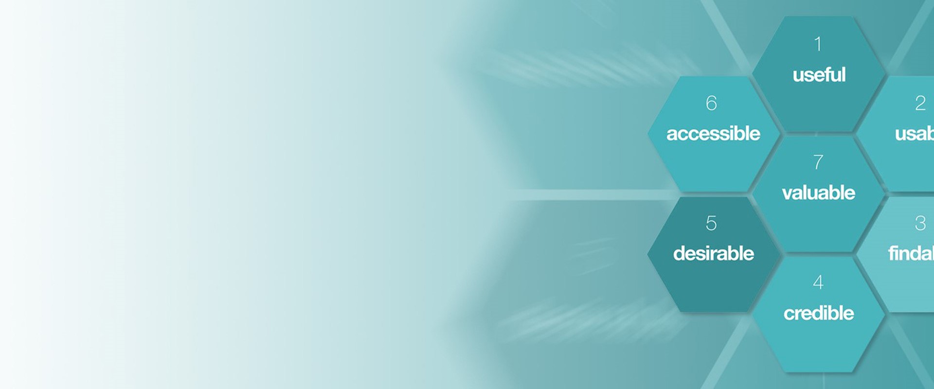
According to Peter Morville, a pioneer in the Ux field who has written several bestselling books and advises many top American companies, there are 7 factors that describe Ux which he arranged into the ‘User Experience Honeycomb’ which is a useful tool from which to understand UX design.
1. Usefulness. If a product isn’t useful to someone, especially in a B2B scenario, what’s the point? In B2B this is the overriding factor and it’s why they’re using the site because they want to perform some kind of business function.
2. Usability. Enabling users to achieve their end objective effectively and efficiently. Products can succeed if they are not usable, but they are less likely to do so, and the failure to deliver a usable product will probably influence them when it comes to contract renewal or if
a better alternative comes along. A good example being the advance of Xero, the online accounting package for small businesses, which has stolen a march on the traditional player Sage.
3. Findable. This refers to the idea that the product must be easy to find, and with digital products, the content within them must be easy to find, too. The reason is quite simple: if you cannot find the content you want in a website quickly, you’re going to stop browsing.
4. Credibility. Credibility relates to the ability of the user to trust in the product or service provided - not just that it does the job it is supposed to do, but also that it will last for a reasonable amount of time or that the information provided with it is accurate and fit-for purpose. It is nearly impossible to deliver a good user experience if the users think the product creator has bad intentions as they’ll take their business elsewhere - very quickly and with vivid memories of a bad experience. Incidentally, they may well tell others, either in passing or increasingly in the form of feedback and negative reviews, to warn other potential customers, or ‘victims’ as they would view them.
5. Desirability is conveyed in design through branding, image, identity, aesthetics, and emotional design. The more desirable a product is, the more likely it is that the user who has it will talk about it and create desire in other users.
6. Accessibility often gets lost in the mix when creating user experiences. Accessibility is about providing an experience which can be accessed by users with a full range of abilities. This includes those who have impaired hearing, vision, motion, or learning. Don’t neglect accessibility in the user experience; it’s not just about showing courtesy and decency, it’s about common sense. Accessible design is often a legal obligation in many jurisdictions, such as the EU.
7. Value. Finally, the product must deliver value. It must deliver value to the business which creates it and to the user who buys or uses it. Without value, it is likely that any initial success of a product will eventually corrode as the realities of natural economics start to undermine it. As designers, we should bear in mind that value is one of the key influences on purchasing decisions.