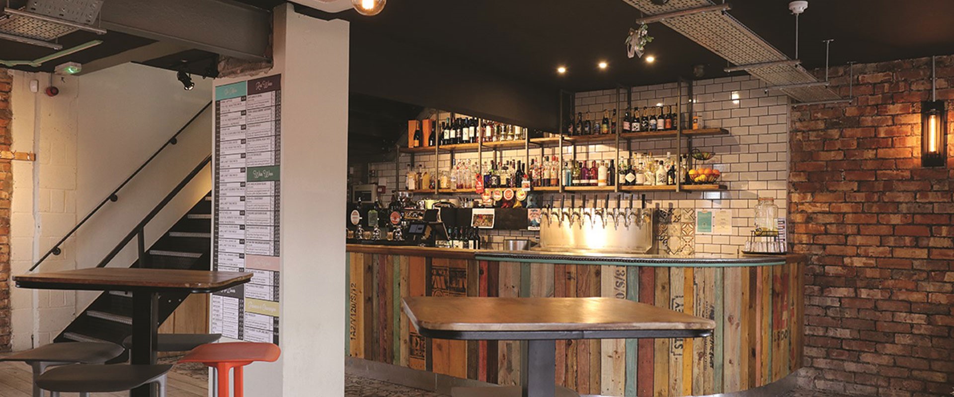
I've blogged before about the 'Sherrington's' journey and how we turned the shop next door to bd2’s offices into a craft beer bar, but for those who can't be bothered reading the posts, we made a video about the story which can be viewed at https://vimeo.com/315656269
The video [produced in-house at bd2] isn't just for the lazy though! It tells the story really nicely, gives a feel for the place and the feedback from users.
The video follows the 'being your own client' angle as the prospect of making the design decisions for the brand and the interiors of the bar itself was an enticing one. I really enjoyed that ‘blank sheet of paper’ starting point - going through the design process with lots of research, coming up with initial concepts and refining them, sketching visuals, drawing the plans, project managing the work and then seeing the ideas come to life.
It started with the brand name - ‘Sherrington’s’ - which harks back to its days as hardware shop, one I used to frequent myself in fact many years ago. Then designing and developing the brand into a finished logo, and then rolling it out across everything from staff aprons to the venue itself - I hand-painted the signs myself in a whole new level of commitment and to get that authentic, hand-done, old-fashioned feel. The old hardware shop theme suits the style of a craft beer bar really well and within the interior there’s lots of exposed brick and steel work, industrial fittings and ephemera to create a feel much like the bars of Manchester’s Northern Quarter, which was one of the objectives.
It’s been a long but worthwhile journey because there’s a great feeling of satisfaction, as a designer, seeing positive reactions to your efforts which are somewhat magnified by it being an actual environment that people can walk around and experience. It’s like a living breathing case study. One which I can also visit for a very nice hoppy IPA after work on a Friday.

