Advanced warning: If you’re not a football fan this blog post might not be for you, although if you like big, bold and brash graphics it might be.
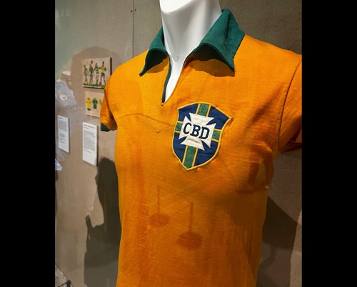
‘Football: Designing the Beautiful Game’ is a new exhibition at the superb Design Museum, just off Kensington Hight Street, London. It features an Aladdin’s cave of artefacts [such as Pele’s first Brazil shirt below], documents, posters and images from the master-planning of some of the world’s most important football stadiums through to the innovations developed to make modern footballs and boots – which contrast markedly with the displays of old brown lumps of sodden leather balls and hobnail boots which, combined with quagmire pitches, seem so far removed from the equipment, stadia and skills of today’s ‘beautiful game’.
The exhibition also chronicles the evolution of graphic design in the sport and how the design of team badges, kits, programs and posters has shaped the sport itself along with individual club and country identities onto tournaments. Whilst many bemoan the commercialisation of the sport, specifically the millions top players now earn with ‘footballer’s wages’ being the go-to criticism of pretty much anything that’s expensive. There’s no doubt that as a marketing success story there’s no bigger or more successful case study. Football is undisputedly the world’s most popular sport with a huge international fan base - apparently half the world’s population watched the 2018 World Cup final.
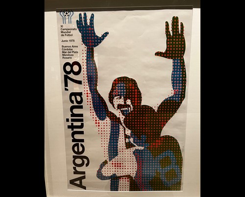
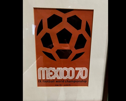
For us designers, the graphics that have underpinned this growth have become iconic and the exhibition had a whole section of classic world cup posters.
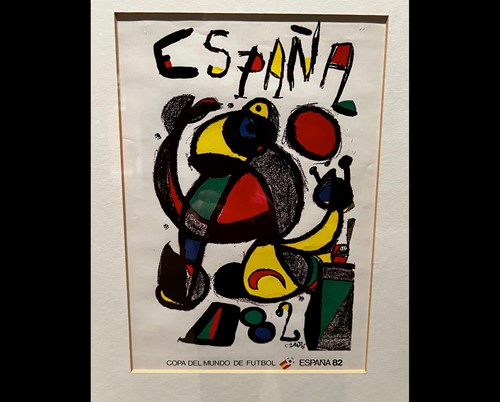
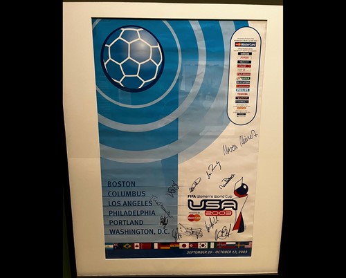
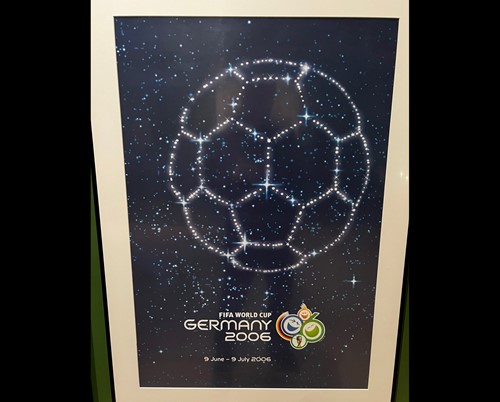
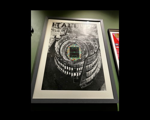
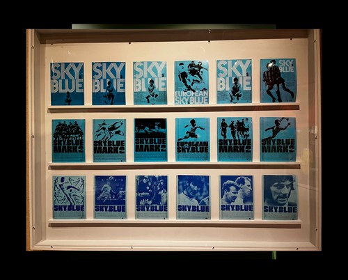
There was also a display of match day programs, which have a cult following of collectors, the most impressive set, from a design perspective, being Man City's series from the 70's.
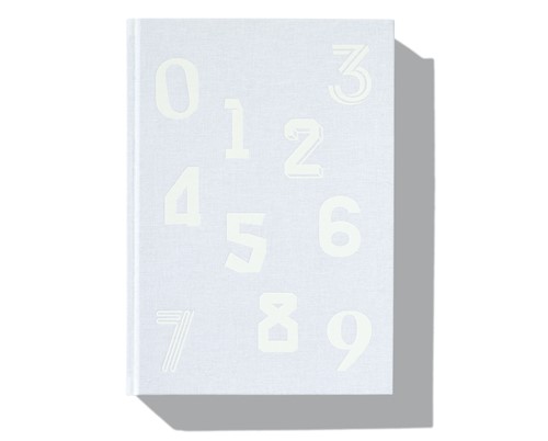
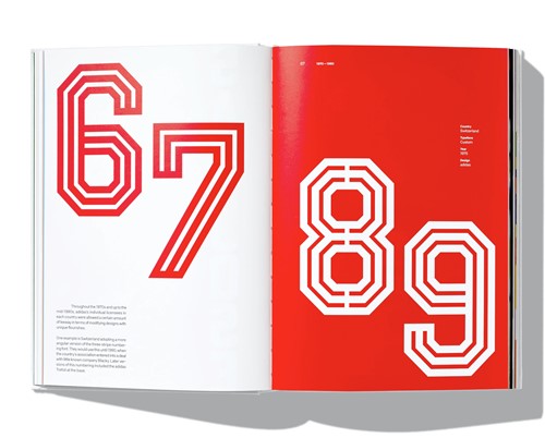
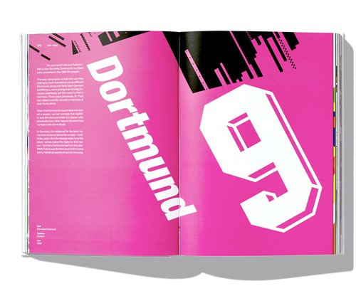
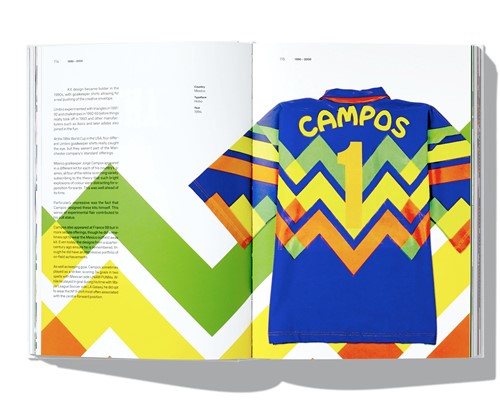
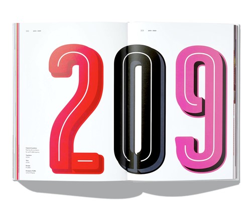
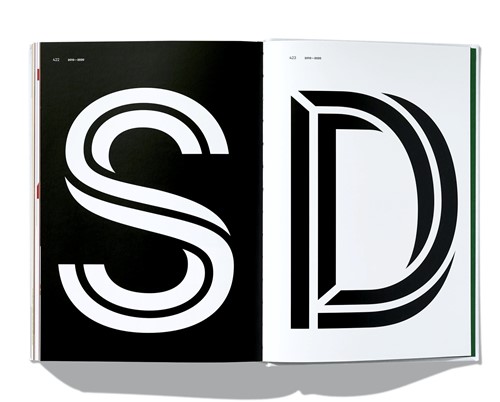
Inevitably, because everyone copied Disneyworld, you have to exit the exhibition via the shop but this was loaded with a football fan's dream treasure trove of retro shirts, posters and many tempting books. The stand out for us graphic designers was this one from Face 37, an irresistible purchase dedicated to the history of shirt numbers. This may may sound a bit niche but they have become as memorable as the strips themselves and the book features the good and the bad, from a typographic perspective including some really great graphics, including many that are instantly recognizable bringing back similarly good and bad memories from a fan’s perspective.
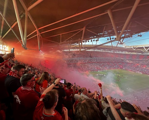
Advanced warning: if you’re not a Liverpool fan, this next bit really won’t be for you, but it’s impossible not to mention that the trip to The Design Museum was part of a weekend to primarily go to the FA cup final which was a hot, sweaty, claustrophobic, nervy but ultimately joyful experience!
