“In everything the organisation does, owns and produces it should project a clear idea of what it is. This is achieved by consistency in purpose, performance and appearance.” Wally Olins.
It’s one of the quotes I refer to most often when trying to explain the importance of consistency to successful branding programs. It’s from the legendary brand guru Wally Olins who I was once lucky enough to meet after an inspirational talk he gave and he kindly signed my copy of his book 'On Brand'.

(I feel I should mention that I appreciate many people might find it strange to have a brand designer as a hero, but he really was great, both as a designer and as a clear and coherent expert on the whole theory of branding. And, just to appear less of a design geek, I should also mention that I do have the more usual sporting heros and have also been lucky enough to meet my biggest two; Kenny Dalglish and Kevin Keegan).
Olins was described by the Financial Times as "the world's leading practitioner of branding and identity" and was one of that type of slightly eccentric characters seemingly only found in Britain with his thick-rimmed round spectacles, trademark bowties and multi-coloured socks. As well as 'On Brand' he wrote several other books on branding theory but he was far from just an academic. He designed the brands of corporate giants such as BT, Volkswagen, Audi and Renault as well as playing a key role in the launch of the mobile phone giant Orange. He also advised cities and countries on their national brand image, including London, Mauritius, Lithuania, Poland, Portugal and Northern Ireland. His agency, Wolff Olins, also designed the controversial 2012 London Olympic logo which was received, shall we say, less than positively when it was launched but has stood the test of time and has since been recognised as groundbreaking with its adaptable and inclusive concept.
What is branding?
Put simply, branding is the creation, coordination and communication of all the assets associated with a company or product. At bd2 we define this as a brand’s DNA.
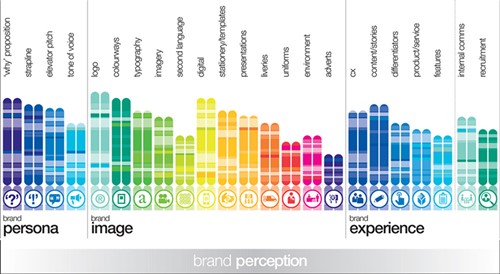
It starts with the brand's persona; the ‘why’ proposition, strapline, elevator pitch and a defined tone of voice; then there’s all the physical assets needed for the brand’s image – logo, colourways, typography and imagery onto all the places or ‘touch points’ where it may be used from digital onto stationery, liveries and environment; finally, and most importantly as this will define how the brand is perceived, the brand experience for customers, the stories the brand uses, the points of differentiation to the competition in its service or product features, not forgetting the internal audience of employees and potential new recruits.
All of these combine to establish and nurture relationships with the brand’s audiences: the better the relationship, the better the brand recognition. Key to achieving this, which stands to reason if you think about it, is consistency because you want to build that recognition through cumulative impact. It’s why all those blue chip companies, from Apple to Coca Cola, are absolutely obsessed with how their brands are presented.
What happens when branding goes wrong?
Brands and their designers don’t always get it right: “When an organisation or company fails to maintain consistency within its branding, they risk diluting the value of their brand and reputation. Over a period of time, this will have irreversible effects for a business and will negatively impact bottom lines, with (sometimes) disastrous consequences.” Jake Athey, VP of Marketing and Customer Experience, Wide.
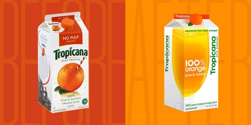
One of the more infamous examples is Tropicana’s ill-fated rebrand of 2009. The simplified packaging, logo, and colourways, along with new marketing campaigns, was disastrous for both the company and the citrus farmers they work with. I've no doubt it was well-intentioned and was probably conceived as a modernisation exercise to make the pack designs in particular, cleaner. But in the redesign all that all important brand recognition was lost as consumers saw it as a new, cheap and generic brand despite the juice being exactly the same. Sales dropped by 20% before the rebrand was scrapped and the packs and brands rolled-back to the older, more familiar branding design.
“Companies with inconsistent branding risk confusing their customers, and even coming across as untrustworthy, low-quality, and unpolished. Ultimately, these mixed messages can get in the way of a brand’s ability to sell their products, grow their business, and build customer loyalty.” Jake Athey, VP of Marketing and Customer Experience, Widen.
How do you keep your branding consistent?
It’s naturally easier when an organisation is smaller and starting out because managing the brand and marketing is often in the hands of just one person or a small team. But as companies and organisations grow, both the number of people involved in implementing the brand increases as does the number of potential applications of the brand, so it inevitably becomes a bit more difficult to control consistency across all the ‘touch points’ – places where the band appears. Every company is different of course and different approaches work for different brands, but the most successful keep their brand under control by implementing the following. Bear in mind that it’s good practice to get these things in place at the beginning when the organisation is small, even if it feels a bit overkill, because without them there are no control mechanisms and things can quickly spiral out of control. Without them, inconsistency is inevitable and leads to a loss of brand recognition, which is critical as you try to grow the business, and it's generally time-consuming and expensive to fix:
Brand strategy
A documented plan of how the organisation plans to use its brand to achieve its business goals to create a ‘joined-up’ customer experience. The brand DNA approach provides a list but at a minimum, the strategy should define the brand’s core values, its personality, the target audience and its positioning or USPs [Unique Selling Points].
Brand identity guidelines
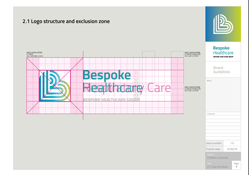
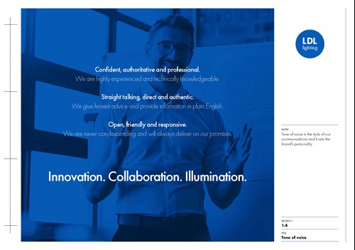
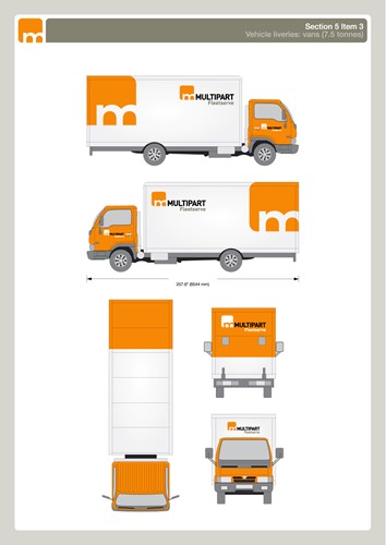
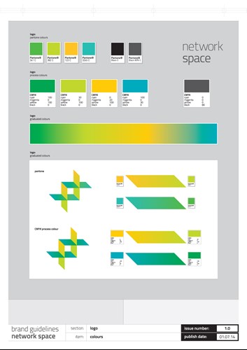
A document to define the use of all the brand’s assets with instructions on how to implement the brand. This should be used by anyone that uses the brand both in internal teams as well as outsourced services, such as printers, signwriters and freelancers. It needs to include all the visual aspects like logos, fonts, and colours, as well as the personality of the brand, such as tone of voice. Here are some examples of a few pages from brand guidelines documents we’ve produced for our clients.
Brand assets repository
It’s advisable to have a central location to store and access the guidelines document and all the brand assets – jpegs, Word and Powerpoint templates, typing styles and so on - so that they're accessible across the organisation. Again, when the marketing team is small this is fairly easy as it can sit in a folder on the network, or a file-sharing tool like Dropbox or Google Drive. As the organisation grows, a bigger and more sophisticated solution might be needed. There are commercially available DAM [Digital Asset Management] and PIM [Product Information Management] systems that control access, include version control and track files as well as storing them. Many of the larger ecommerce sites we’ve built also integrate with PIM servers to use the same visual assets as print based media and are automatically updated to ensure consistency, version control and to massively speed up the process whenever there are updates. As approved services providers we also have access to the DAM systems of our bigger clients, including Hewlett Packard and Coca Cola European Partners, which allow us to download all the branded assets we need to work on the accounts.
It’s worth mentioning that the current situation with the Coronavirus pandemic has resulted in many teams becoming dispersed and working from home making these tools even more critical. It’s added complexities to the implementation process and with many businesses closed down, brand loyalty has really been tested adding further emphasis to the need for consistency – a different logo or colour scheme, or different wording on a webpage to what they might read in-store for example – can lead to a loss of recognition.
Consistency is key
A key part of making your brand memorable is cumulative impact across all touch points to build brand recognition. It requires coordination to deliver a consistent experience across all touch points both physical and digital. By putting the right processes and tools in place, ideally from the get-go, it helps organisations to present their brand consistently.
This approach also helps to prevent misuse and removes the temptation for any customer-facing person to start creating their own branded assets, which can be risky. How many times have we seen off-brand Powerpoint slides in a corporate deck where someone has used their initiative and raided some dreadful clip art library? You can’t really blame them if there’s a void that they’re just trying to fill, but if you provide the branded material for them in an accessible place with some simple guidelines on how to use them, it not only makes their job easier it helps build that critical brand consistency.
Sadly, the great Wally Olins passed away in 2014 having reached the ripe old age of 94. It only seems right to let him have the last word and finish on another of his insightful and, as ever, apposite quotes:
“The best and most successful brands are completely coherent. Every aspect of what they do and what they are reinforces everything else.” Wally Olins.

